A simple way to add some variety to your compositions
Yesterday I took a photography student who’s passion was botany to Selby Gardens for a session of inspiration. She felt her images were becoming repetitive. After showing me a portfolio of her favorite 20 or so recent images we discovered that indeed many of the images shared the same characteristics and were mostly captured from similar angles with similar compositions. I also felt that many of her images were perhaps too busy which is why many seemed very similar to one another even though they were of different subjects.
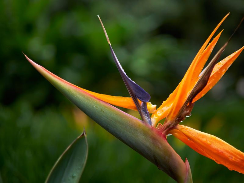
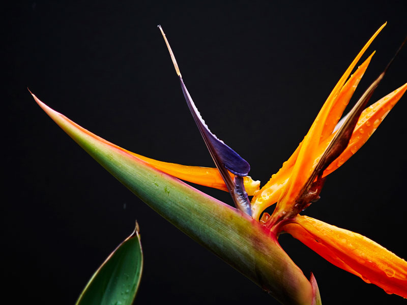
Here we have a Bird of Paradise Bloom with a blurred background as found.
I’m a big proponent of simplicity and my favorite quote is “Less is More”. Great images start with a subject your viewer can relate to and are brought to live by a combination of color, light and composition. When your subject is strong, don’t let anything else compete for it’s attention. This can be achieved in a variety of ways and most people use debth of field to make sure their subject stands out by blurring the background and foreground.
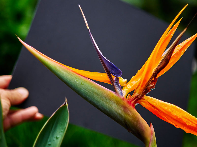
A small black card may be just the thing we need to make our subject really stand out without touching or disrupting the bloom
Sometimes this technique becomes rather repetitive and often similar colors found in the subject and background often don’t provide enough separation so I showed one trick I often use in my professional career, particularly in studio or when shooting food on location, a simple card. In fact, I almost always have one in my bag, even if it is small. The card can be any color but I prefer using either white or black. These cards are also very handy for setting your white balance.
The final image with the card in the background looks quite different from the original image and you can see how this technique commonly used in the studio can be employed in the field to really make your subject stand out and highlight its true colors
Really great results can be achieved by simply placing the card behind the subject when shooting. You can experiment with different distances between the subject and card and different aperture and focal lengths. If you are shooting in aperture preferred or auto exposure you’ll probably get better or more dramatic results if you over under expose your subject or if you spot meter on your subject.
While this student was not an advanced photographer by any means and her equipment was very basic she was able to get great results with just a little practice. Try it for yourself.
The cards can be purchased at most any office or art supply store. The card shown was a scrap at a local Sarasota art store for only 85 cents!