Perception is everything
We actually don’t see color but rather perceive it. That’s because we process color in our brains and not specifically in our eyes. Each of us interprets colors in a different way.
We do generally accept that specific colors convey certain feelings and each of us has our favorites probably because it has the strongest impact on us in one way or another. As photographers we need to understand the psychological impact of color to help you better convey a mood in your photograph.
The discussion of both color and color in photography is very broad and almost limitless, but here, we’ll cover the basics that you can perhaps incorporate into your next composition or project to perhaps see things a little different.
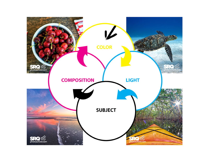
I’ve always professed that color is one of the major components to a strong image along with subject, composition and light. Other photographers may disagree with me but these four elements have worked for me throughout my career in assessing an image for most any application.
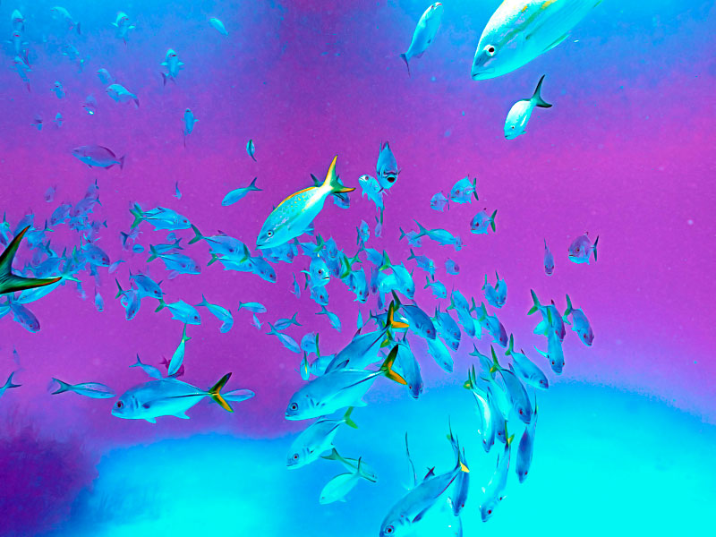
Cool toned colors are green, blue and purple and emit feelings of tranquility and calmness
Warm toned colors are red, yellow and orange and tend to run the gamut from anger to warmth depending on their saturation and setting.
Let’s look at some specific colors:
BLACK: Power | Strength | Stability | Grief – Black is often associated with power. Also elegance and sophistication. It’s also the color that makes the wearer appear thinner. Grief is psychologically depicted with regards to black mourning garments in many cultures including our own. It’s probably one of the very most versatile colors used in our lives.
WHITE: Purity | Cleanliness | Innocence – White is certainly a color of innocence. A bride on her wedding day wears white and when a baby is baptized, the suit is white. A white picket fence symbolizes a safe and happy home. Pure thoughts are often associated with white as it cleanliness and sterility which is why medical staff often wear white even though it is not very practical.
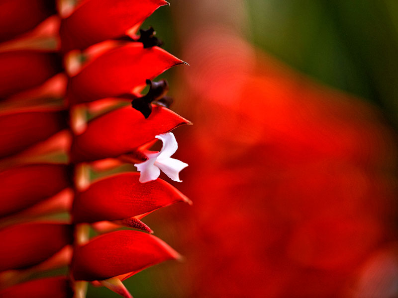
RED: Notice me | Speed | Anger | Love – Red is very diverse. As an example, it could symbolize love, but also speed as in a red sports car. It’s documented that more speeding tickets are issued to drivers of red cars. Red is associated with stimulation in that it triggers endorphins in the brain. Anger and rage are often represented by red as well as powerful passion.
YELLOW: Happiness | Optimism – Yellow tends to spur creative thoughts in addition to bringing promise to the future. Yellow stimulates the brain and jump starts the nervous system. With its strong connection to the sun, its psychological connection suggests good times, happiness, warmth, friendship and laughter.
BLUE: Calm | Tranquility – A personal favorite, blue causes the body to produce chemicals that are calming. Blue is seen as a trustworthy color. Clean. Pure. Its most common association is a clear blue sky or sparkling blue water that makes us feel optimistic.
GREEN: Nature | Growth | Harmony – Green is the predominant color in the natural world giving it a refreshing quality. It’s a soothing color to view. With its strong connection to nature, it provides a tranquil psychological impact.
ORANGE: Fun | Energy – Orange tends to stimulate activity and as well as the appetite. It also connotes a feeling of change – think fall color. If its hue leans more toward the red side, it creates excitement. If it leans more toward the yellow, it’s more tranquil so this color is an excellent example of how broad it can be in regards to the emotions it evokes based on subject matter.
PURPLE: Royalty | Wealth – Purple is often associated with royalty as it’s the color of kings and queens. Royal attire was often purple. Additionally, sophistication is a characteristic of purple. Purple can be both uplifting and calming depending on its hue and saturation. Purple is typically not found in nature except for some select blossoms. It is an excellent accent color and compliments blue very well.
We are influenced by these colors each and every day and they are a primary tool in advertising to deliver a message. Understanding of how color affects how we react to things and applying this to your photography will change the way people look at your work.

